There's no single place to share and discover all the media you love
When it comes to sharing media online, there is no single application that allows users to simultaneously track their previous, current, and future consumption across types — movies, books, music, games, anime, recipes, and more. Most media platforms are siloed by design:
- myanimelist — anime only
- Letterboxd — focused solely on movies
- Goodreads / StoryGraph — focused solely on books
- Shelf — only top favorites and current media, no list sorting or custom grouping
Beyond single-media limitations, existing platforms are list-centric rather than user-centric — emphasizing gamified rankings over personalized identity. They fail to give users a space that genuinely reflects who they are through what they consume.
How might we design a cross-media platform that lets users express their identity through their media interests, discover new content through social connections, and share personalized recommendations across all media types?
Understanding what users actually need from a media platform
Research surfaced four core user needs that shaped the entire design direction:
Personalized Display
- Showcase currently consuming media on a personal homepage
- Custom rating and sorting systems to reflect individual preferences
Cross-Media Integration
- Import lists from existing platforms (Letterboxd, Goodreads)
- Create custom lists for media types with no existing platform (recipes, podcasts)
Flexible List Management
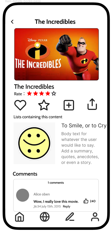
- Create, edit, rate, and sort lists freely
- Drag-and-drop sorting and custom weight adjustments
- "Top 5–10" highlights alongside fully custom ordering
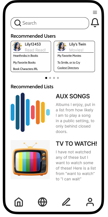
Social & Discovery
- Browse others' profiles and view their media consumption
- Follow, comment, and compare to foster interaction
- Send and receive personalized cross-media recommendations
From the first feedback session, we learned we needed to sharpen our target audience rather than designing for "everybody." We responded by creating personas representing distinct types of media consumers — from the multi-media enthusiast to the genre-specialist — to anchor design decisions in real user contexts.
Starting on paper, then pivoting based on what we learned
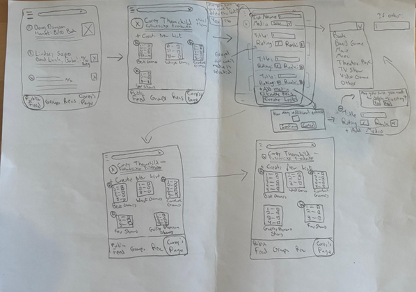
We chose an iterative design process over waterfall — starting with wireframe sketches before any digital work. This let us establish features and interaction flows quickly and make on-the-fly adjustments far faster than a digital prototype would allow.
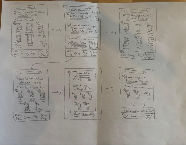
A key pivot came before the second feedback session: we had been so focused on single-type media lists that we missed a core feature — the ability to create a multi-media list with entries from more than one media type. We also realized our list model was too numerical and ranking-focused, leaving little room for creative self-expression.
The pivot: from ranking-focused lists to expression-focused lists — giving users full control over how they rate, sort, and present their media identity.
We revamped the Create List wireframe to support multimedia lists, flexible sorting (alphabetical, chronological, drag-and-drop), and a custom rating system where users could define their own scale — text, images, or gifs — rather than being locked into /5 or /10.
Three rounds of feedback across low- and high-fidelity prototypes
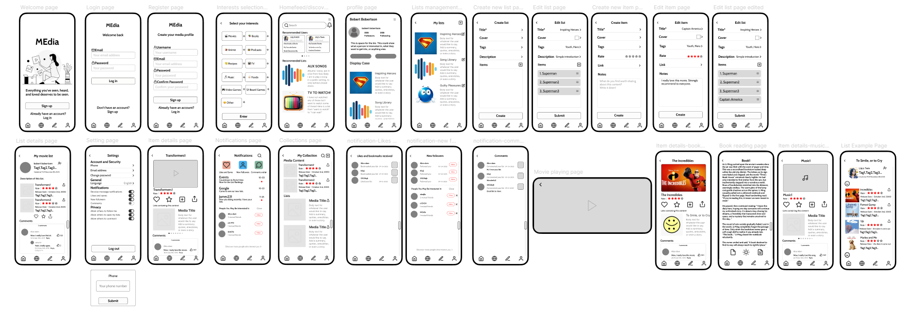
The low-fidelity phase focused on structure and logic — information hierarchy, interaction paths, and navigation flows — using simple rectangles and arrows to validate concepts before investing in visual polish. We built the essential screens: onboarding, list management, detail view, and interaction components.
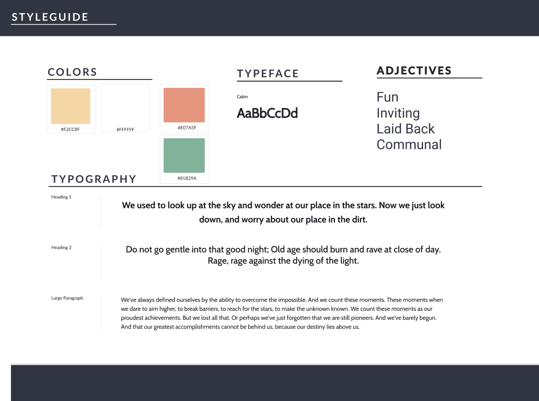
Moving into high-fidelity, we used Figma's component system to centrally manage buttons, input fields, and navigation bars, then layered in brand colors, typography, icons, and interactive prototyping (clicks, swipes, transitions) to simulate authentic use.
Three feedback sessions shaped the design at each stage:
- Session 1: Sharpen focus — define target audience and core features. Led to persona creation and a prioritized feature list.
- Session 2: Add multimedia list support and allow more creative control over how users rate and sort media. Led to the Create List redesign.
- Session 3 (focus group): Three unanimous insights — users value personalized recommendations from honest sources, creative rating scales capture nuance better than numerical presets, and expressive user profiles are strongly preferred over the sterile aesthetics of modern social media. These were addressed directly in the high-fidelity design.
A platform built around user identity, not platform aesthetics
The final high-fidelity prototype delivers a cross-media social platform where users can express themselves through custom lists, personalized rating scales, and an expressive profile — then discover new media through honest recommendations from people who share their taste.
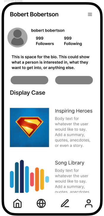
Key design decisions reflected directly from user feedback: lists are flexible and creative rather than purely numerical; rating scales are fully customizable; and the profile page is designed to feel like a genuine expression of the user's media identity rather than a standardized social media template.
What I learned
The most important shift in this project was recognizing that giving users extensive creative control — custom lists, custom ratings, custom profiles — is a double-edged sword. The flexibility that makes the platform powerful can also feel overwhelming. Designing sensible defaults and progressive disclosure became as important as the features themselves.
A key evolution from low to high fidelity was moving away from numerical ranking toward creative expression. Users don't always want to quantify how they feel about media — sometimes they want to describe it, reference it, or contextualize it. Allowing custom rating scales unlocked a more honest and personal form of media curation.
The future direction for MEdia would be a transparent, participatory recommendation system — where users can not only express their interests freely but also understand how recommendations are generated, co-edit lists with others, and actively shape the algorithmic logic rather than being passive recipients of it.